

Menu engineering is a data-driven process that uses POS sales data, plate costs, and contribution margins to classify every menu item by popularity and profitability, then guides pricing, placement, and promotion decisions to improve overall margin. Introduced in 1982 and built around a four-quadrant matrix of Stars, Puzzles, Plow horses, and Dogs. It remains the most practical framework for turning a menu into a revenue tool.
Your immediate action checklist:
- Export POS sales data for a defined time window (minimum 4 weeks, ideally 12).
- Pull standardized recipe costs for every item on that export.
- Calculate contribution margin (menu price minus plate cost) for each item.
- Identify one high-volume, low-margin item to test first.
Pro Tip: Don't wait until you have perfect data. A rough plate cost from your most recent supplier invoices is enough to start. Accuracy improves as you iterate.
Key Takeaways
Menu engineering delivers lasting margin improvement only when it runs on accurate, current recipe costs and a consistent quarterly cadence.
| Point | Details |
|---|---|
| Start with contribution margin | Calculate menu price minus plate cost for every item before plotting the four-quadrant matrix. |
| Segment by category | Run separate analyses for appetizers, mains, and desserts to avoid distorted thresholds. |
| Design executes engineering | Place Stars and Puzzles in high-attention zones; use descriptive language and selective photos to lift take rates. |
| Test one variable at a time | Change price, placement, or description separately and track menu mix % and average check for at least 4 weeks. |
| Pantryhub keeps costs current | Pantryhub connects recipe cards to live supplier prices, so contribution margins stay accurate between quarterly reviews. |
Table of Contents
- How to run a menu engineering review from data to action
- The formulas you need and a worked example
- What the four quadrants tell you and what to do about each
- How menu psychology and design steer guests toward profitable items
- Implementing changes and measuring whether they worked
- What menu engineering does not capture (and where it can mislead you)
- Keeping menu engineering accurate with recipe costing and inventory integration
- How menu engineering informs dynamic pricing strategies
- Advanced analysis techniques: clustering and trend analysis
- Using customer feedback to sharpen menu engineering decisions
- What successful menu engineering looks like in practice
- The part of menu engineering most operators underestimate
- Accurate plate costs, faster re-costs: how Pantryhub supports menu engineering
- Sources
How to run a menu engineering review from data to action
A repeatable workflow matters more than a one-time audit. Run this process quarterly, or after any significant supplier price change.
Define your analysis window
Seasonality distorts results. A 4-week window captures enough volume for most full-service restaurants, but 12 weeks gives you a cleaner signal. Exclude weeks affected by unusual events (a private buyout, a local festival), unless those events are a regular part of your trade.
For low-volume specials with fewer than 30 covers sold in the window, flag them separately. Don't plot them on the main matrix; they'll skew your popularity thresholds without giving you statistically useful data.
Collect the right data
You need four inputs before you touch a spreadsheet:
- POS sales export: units sold and revenue per item, filtered by category (appetizers, mains, desserts, beverages).
- Standardized recipe cards: ingredient quantities, portion sizes, and current purchase prices per unit.
- Current menu prices: what guests actually pay, including any active discounts.
- Complexity flags: a simple note on items with high prep time or specialized labor. This won't feed the matrix directly, but it informs your action decisions later.
The six-step process
- Standardize recipes and portion sizes. Every item needs a fixed recipe card before you cost it. Inconsistent portions make plate costs meaningless.
- Calculate plate cost. Sum the cost of every ingredient at its current purchase price, adjusted for yield. (Full formula in the next section.)
- Compute contribution margin per item. Menu price minus plate cost.
- Compute popularity. Each item's units sold divided by total units sold across the category, expressed as a percentage.
- Plot items on the four-quadrant matrix. Contribution margin on the y-axis, popularity on the x-axis. Average contribution margin and average popularity are your quadrant thresholds.
- Define actions per quadrant. Stars get protected, Puzzles get repositioned, Plow horses get margin work, Dogs get reviewed for removal or rework.
Pro Tip: Segment by category before you plot. Comparing a $28 entrée's contribution margin to a $6 side dish in the same matrix produces misleading thresholds. Run appetizers, mains, and desserts as separate analyses.
For a single location, a quarterly re-run is sufficient. Multi-site operators should centralize recipe cards and run the analysis at the group level, then compare site-level deviations to spot multi-location stock and pricing inconsistencies.
The formulas you need and a worked example
Three formulas drive the entire process. Here they are in copy-and-paste form.
Plate cost (food cost per dish):
Plate Cost = Σ (Ingredient quantity used × cost per unit) ÷ yield factor
Yield factor accounts for trim loss, cooking shrinkage, and portioning waste. A chicken breast purchased at $6.00/lb with a 75% usable yield has an effective cost of $8.00/lb.
Contribution margin:
Contribution Margin (CM) = Menu Price − Plate Cost
Popularity (menu mix %):
Popularity % = (Units sold of item ÷ Total units sold in category) × 100
Worked example: five-item dinner menu
Total units sold: 600 Average contribution margin: ($20.80 + $26.00 + $18.50 + $19.60 + $20.00) ÷ 5 = $20.98 Average popularity threshold: 100% ÷ 5 items = 20%
Plot each item with popularity on the x-axis and contribution margin on the y-axis. Items above $20.98 CM and above 20% popularity are Stars. Items below both thresholds are Dogs.
In this example: Chicken Piccata (high popularity, above-average CM) is a Star. Ribeye Steak (above-average CM, below-average popularity) is a Puzzle. Mushroom Risotto (above-average popularity, below-average CM) is a Plow horse. Lamb Shank sits just below average on both, making it a Dog candidate.
Spreadsheet tip: In Google Sheets or Excel, use a scatter chart with CM on the y-axis and popularity % on the x-axis. Add two reference lines at your average CM and average popularity % to draw the quadrant boundaries visually.
What the four quadrants tell you and what to do about each
The four-quadrant matrix gives every item a clear classification and a default action. Here's how to read each one and respond.
Stars (high popularity, high contribution margin)
These are your best performers. Protect them.
- Keep their recipe consistent and their plate cost monitored closely.
- Give them prime placement on the menu (top-right of a page, first item in a category).
- Resist the urge to discount them; they don't need the help.
- Train servers to recommend them confidently.
Puzzles (low popularity, high contribution margin)
High margin, but guests aren't ordering them. The fix is usually visibility or perception, not price.
- Rename the item with more evocative language ("Pan-Seared Halibut with Lemon Caper Butter" outperforms "Fish of the Day").
- Reposition it higher on the menu or add a subtle highlight (a box, a chef's recommendation icon).
- Check whether the price is creating a barrier; a small reduction can sometimes lift volume enough to improve total margin contribution.
- Consider whether a photo would help, particularly on digital and QR menus.
Plow horses (high popularity, low contribution margin)
Guests love them, but they're not pulling their weight on margin. Don't remove them.
- Review the recipe for cost-reduction opportunities: a portion tweak, a lower-cost protein alternative, or a garnish simplification.
- Test a modest price increase (typically $1–$2) and monitor whether volume holds.
- Bundle them with a higher-margin add-on (a side, a sauce, a beverage pairing).
Dogs (low popularity, low contribution margin)
The default instinct is to cut them, but removing items based solely on POS data can backfire if they serve as traffic drivers, anchor price perception, or satisfy a specific guest segment.
- Ask: does this item bring in a guest who then orders other things? If yes, it may be a strategic keeper.
- Ask: does it anchor the high end of your price range, making other items look more reasonable? That's a decoy function worth preserving.
- If neither applies, remove it or replace it with a tested alternative.
Pro Tip: Before cutting a Dog, run a 30-day server-recommendation push. If volume doesn't move, the item has no advocates and no audience. Cut it.
How menu psychology and design steer guests toward profitable items
Engineering tells you which items to promote. Design executes that promotion. Treating the menu as a sales tool that combines layout, pricing, and photography is what converts an analysis into measurable revenue.
Placement and eye movement
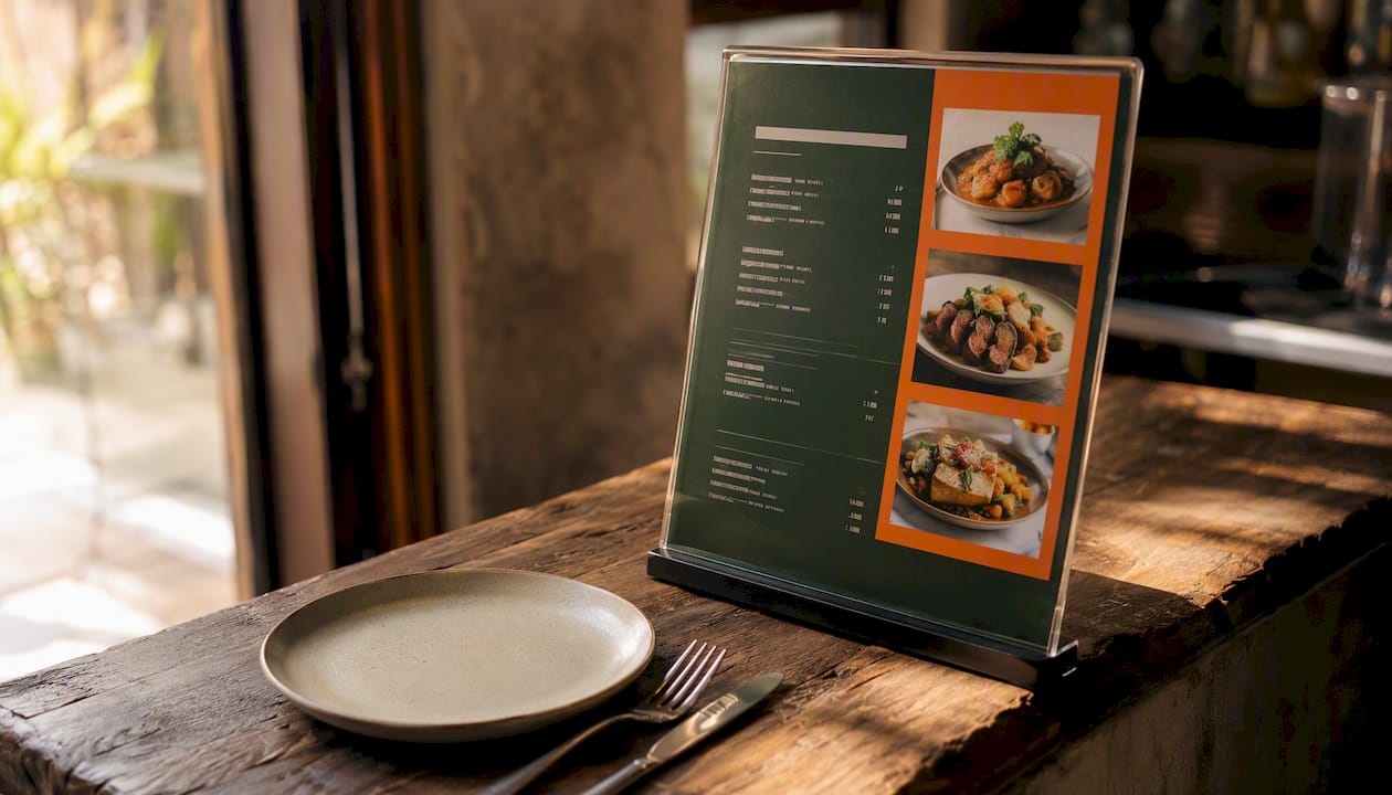
Eye-tracking research shows guests typically scan a menu in a pattern that favors the top-right area of a two-panel menu and the first and last items in any list. Put your Stars and Puzzles there. Bury Dogs at the bottom of a category or remove them from prominent positions entirely.
On digital and QR menus, the serial-position effect is even stronger: the first item in a scrollable list captures disproportionate attention. Use that real estate deliberately.
Descriptive language
Cornell University research supports that descriptive, sensory menu labels can significantly increase item sales. "Slow-Braised Short Rib with Roasted Garlic Jus" outperforms "Beef Short Rib" not because guests are fooled, but because the description sets an expectation of quality that justifies the price. Keep descriptions to two lines; longer copy loses readers.
Price presentation
Removing the dollar sign from menu prices reduces the psychological "pain of paying," a finding backed by Cornell's Food and Brand Lab. Additional tactics:
- Avoid right-aligning prices in a column; it invites price comparison rather than dish consideration.
- Use charm pricing ($18.95) for mid-range items to signal value; use round numbers ($22) for premium items to signal quality.
- Place a high-priced anchor item near the top of a category to make surrounding items feel more accessible.
Photography
Consistent, selective photography increases perceived value when used well. The rules:
- Use photos for no more than 20–25% of items; photographing everything dilutes emphasis.
- Prioritize Puzzles and Stars; a photo on a high-margin item that guests weren't ordering often moves it up a quadrant.
- Keep image style consistent (same lighting, same plating angle). Inconsistency signals low quality.
- On delivery platforms, photos are non-negotiable; items without images convert at significantly lower rates.
Industry summaries and eye-tracking research suggest menu design changes can increase average order value in the 10–30% range depending on the tactics applied. Descriptive copy and selective photography are among the lowest-cost, highest-impact levers available.
Pro Tip: Don't highlight more than two or three items per category. Every item you call out as "special" dilutes the signal. Emphasis works only when it's selective.
Implementing changes and measuring whether they worked
Changes without measurement are just guesses. Here's how to test safely and read results clearly.
Change control checklist
- Change one variable at a time (price, placement, or description, not all three simultaneously).
- Brief your front-of-house team before any menu change goes live; server recommendations amplify design changes significantly.
- Update POS item names and SKUs to match the new menu so your next data pull stays clean.
- Set a test start date and log it; you'll need it to isolate the effect.
KPIs to track
- Menu mix %: has the target item's share of category sales increased?
- Item-level contribution margin: has the margin per cover improved?
- Average check: is the overall spend per guest moving?
- Attach rate: are guests adding the paired side or beverage you bundled with a Plow horse?
- Complexity indicator: has ticket time or error rate changed? A price increase that slows the kitchen can erase the margin gain.
Testing on digital and delivery channels
A/B testing is more accessible on digital menus and delivery platforms than on printed menus. Most delivery platforms allow you to run different item descriptions or photos across time periods. For printed menus, a practical proxy is to run the new version for 4 weeks, then compare the same 4-week period from the prior quarter.
If guest satisfaction scores (from review platforms or table surveys) drop during a test period, pause and review before continuing. A margin gain that costs you repeat covers is a net loss.
What menu engineering does not capture (and where it can mislead you)
Menu engineering is a powerful framework, but it has real blind spots. Knowing them prevents costly mistakes.
- Labor and complexity costs are excluded. A dish with a $22 contribution margin that takes 18 minutes of skilled prep time may be less profitable than a $16 CM dish that takes 4 minutes. EHL Insights notes that operators who rely solely on food cost without accounting for labor and waste often fail to hit target margins. Add a complexity flag to your matrix and factor it into action decisions.
- Waste and yield variance are invisible. If your recipe card assumes 80% yield on a protein but your kitchen is running at 65%, your plate costs are understated. Track actual waste and yield against recipe assumptions regularly.
- Small-sample volatility distorts results. An item sold 12 times in a 4-week window is not statistically meaningful. Flag low-volume items and hold them out of the main matrix.
- Channel differences are ignored. A dish that performs as a Star in your dining room may be a Dog on a delivery platform because of packaging cost, travel time, or photo quality. Run separate analyses for dine-in and delivery.
- Price elasticity is not modeled. The matrix tells you an item has a low margin; it doesn't tell you whether guests will accept a price increase. Test before you commit.
- Outdated recipe costs corrupt everything. If your ingredient costs haven't been updated since your last supplier price change, your contribution margins are fiction. Set a minimum update cadence of once per quarter, or after any significant price movement.
Keeping menu engineering accurate with recipe costing and inventory integration
The most common failure mode for menu-engineering projects is stale data. Operators who rely on layout alone without accurate, timely recipe costing consistently miss margin targets. Integration between your recipe cards, purchase invoices, and POS is what keeps the numbers honest.
Implementation checklist
- Connect recipe cards to purchase invoices. Every ingredient in a recipe should link to a supplier SKU so that when invoice prices change, plate costs update automatically or flag for review.
- Set yield factors per ingredient. Don't use raw purchase weight as your cost basis. A 5 lb bag of spinach that yields 3.5 lbs after cleaning has a real cost 43% higher than the invoice price suggests.
- Map POS item names to recipe cards. Every item sold through the POS should tie to a specific recipe so sales data and cost data speak the same language.
- Centralize recipes for multi-site groups. A group running three locations with three different recipe versions of the same dish has three different cost bases. Centralized recipe management eliminates that inconsistency. Inventory visibility across sites is the operational foundation for this.
- Schedule quarterly re-costs. Set a calendar reminder. Supplier prices shift; your recipe costs should reflect that.
Recommended data flow
Your POS exports sales volume. Your inventory system tracks purchase prices and stock movements. Your recipe-costing tool sits between them, converting purchase prices into plate costs and feeding contribution margins back into your analysis. When these three systems share data, a supplier price increase triggers a plate cost update automatically, and your next menu-engineering run starts with accurate numbers.
Pro Tip: Set low-stock alerts on your highest-margin ingredients. Running out of a Star item's key component mid-service doesn't just frustrate guests; it erases the margin contribution you were counting on for that shift. Ingredient-level tracking makes this practical.
How menu engineering informs dynamic pricing strategies
Dynamic pricing in restaurants means adjusting prices based on demand signals: time of day, day of week, channel, or seasonal ingredient cost. Menu engineering provides the item-level data that makes dynamic pricing decisions defensible rather than arbitrary.
A Star item with consistently high demand and a healthy contribution margin is a candidate for peak-hour price testing. A Plow horse with high volume but thin margins may justify a small price increase during your busiest service, when guests are less price-sensitive and the kitchen is running at capacity anyway.
Delivery platforms have made dynamic pricing more accessible. Most major platforms allow operators to set different price points for delivery versus dine-in, which is a practical way to recover packaging and commission costs without alienating in-room guests. The key is to run your menu-engineering matrix separately for each channel so you're pricing against the right cost and demand baseline.
One caution: frequent visible price changes erode trust. Dynamic pricing works best when it's channel-specific or time-of-day-specific rather than item-by-item fluctuations that guests notice between visits.
Advanced analysis techniques: clustering and trend analysis
Once you've run two or three quarterly analyses, you have enough longitudinal data to go beyond the basic matrix.
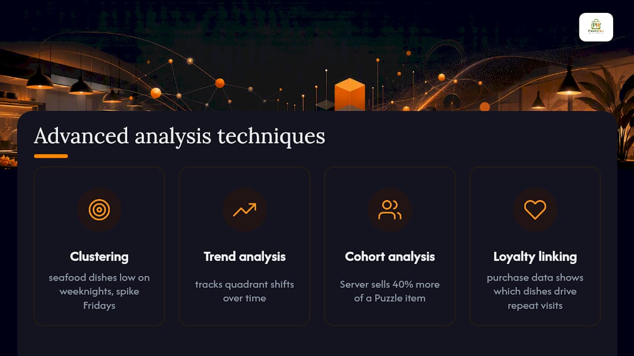
Item clustering groups menu items by shared characteristics: similar ingredients, prep techniques, price bands, or guest demographics. A cluster analysis might reveal that your high-margin seafood dishes consistently underperform on weeknights but spike on Fridays, suggesting a targeted promotion strategy rather than a permanent menu change.
Trend analysis tracks how an item's quadrant position shifts over time. A dish that was a Star six months ago and is now a Plow horse tells you something has changed: ingredient costs may have risen, a competitor may have introduced a similar dish, or guest preferences may be shifting. Catching that drift early gives you time to respond before the margin impact compounds.
Cohort analysis by server or shift is an underused technique. If one server consistently sells 40% more of a specific Puzzle item than their colleagues, that's a training signal, not luck. Identify what they're saying and build it into your team briefings.
For operators with access to loyalty program data, linking purchase history to menu items reveals which dishes drive repeat visits. That's a dimension the standard matrix misses entirely, and it's directly relevant to decisions about whether to keep or cut a Dog.
Using customer feedback to sharpen menu engineering decisions
POS data tells you what guests ordered. It doesn't tell you why they didn't order something else, or whether they were satisfied with what they got. Feedback fills that gap.
Post-visit surveys (via email, SMS, or QR code at the table) can ask directly about menu satisfaction: which dishes guests would recommend, which they found poor value, and what they wished was on the menu. Keep surveys short (three to five questions) or response rates drop below useful levels.
Review platform analysis (Google, Yelp, TripAdvisor) surfaces dish-level sentiment at scale. A dish that appears frequently in negative reviews alongside words like "small portion" or "overpriced" is a Plow horse or Dog candidate even if its POS volume looks acceptable.
Server feedback is the fastest and cheapest source of qualitative data. A weekly five-minute debrief with front-of-house staff surfaces guest comments that never make it into a review. Ask specifically: which dishes are guests asking about but not ordering? Which are they sending back or leaving unfinished?
Integrate feedback into your quarterly review by adding a qualitative column to your matrix spreadsheet. An item's quadrant position plus guest sentiment gives you a much richer picture than sales data alone.
What successful menu engineering looks like in practice
Theory lands differently when you see it applied. Here are three scenarios that illustrate how different restaurant types use these techniques.
Fast-casual burger concept: A 12-item menu with two items accounting for 60% of all orders. The operator ran a contribution margin analysis and found that one of those two items, a signature double patty, had a plate cost 8 percentage points higher than the rest of the menu due to a premium bun and house-made sauce. Rather than removing it (it was a traffic driver and a brand anchor), they simplified the sauce recipe and negotiated a volume discount on the bun. Plate cost dropped by $1.40 per cover; volume held. That's a meaningful margin recovery across hundreds of covers per week.
Independent fine dining: A 30-item tasting-menu-adjacent concept with several Puzzle items: high-margin dishes that guests rarely ordered because the descriptions were clinical and the placement buried them in the middle of a dense menu. Renaming three dishes with sensory language and moving them to the top of their respective categories lifted their combined share of covers by roughly 9 percentage points over one quarter.
Multi-location casual dining group: Running three locations with different regional menus created a recipe-costing nightmare. The group centralized recipe cards, standardized portion sizes across sites, and ran a single group-level matrix. They identified six items that were Dogs at all three locations and replaced them with two new dishes tested at the highest-volume site first. The streamlined menu reduced kitchen complexity and improved ticket times.
The part of menu engineering most operators underestimate
Menu engineering is often framed as a once-a-year project. Run the numbers, move some items around, update the menu design. Done. That framing is why so many operators see a short-term lift and then watch margins drift back.
The real value of this framework is in the cadence, not the one-time audit. Supplier prices change. Guest preferences shift. A dish that was a Star in Q1 can become a Plow horse by Q3 if ingredient costs have crept up and you haven't noticed. The operators who get lasting results from menu engineering treat it as a quarterly operational rhythm, not a design project.
There's also a tendency to over-index on design changes and under-invest in the data infrastructure that makes those changes defensible. Moving a dish to the top-right of the menu is easy. Knowing whether that move actually changed its contribution to your weekly margin requires clean POS data, current recipe costs, and a consistent analysis process. Without that infrastructure, you're decorating, not engineering.
One more thing worth saying plainly: your servers are your most powerful menu-engineering tool. A well-trained server who can describe a Puzzle item with genuine enthusiasm will move more covers than any placement change. Design and data set the conditions; your team executes them.
Accurate plate costs, faster re-costs: how Pantryhub supports menu engineering
The biggest time sink in menu engineering isn't the analysis. It's keeping recipe costs current. Every time a supplier changes a price, your contribution margins shift, and if you're updating costs manually, you're always working with yesterday's numbers.
Pantryhub connects your recipe cards directly to supplier invoices and real-time stock data, so plate costs update as purchase prices change. Low-stock alerts protect your highest-margin ingredients from running out mid-service. For multi-site groups, centralized recipe management means every location is working from the same cost baseline, not three different versions of the same dish.
The result: your next menu-engineering review starts with accurate numbers, not a spreadsheet you've been meaning to update. Less time on data cleanup, more time on decisions that move margin.
Ready to keep your recipe costs current without the manual work? Explore Pantryhub's hospitality inventory platform and see how integrated recipe costing fits your operation.
Sources
The following sources informed this guide and are worth reading directly for deeper context.
- Menu Engineering Beyond the Basics: Optimizing Strategy, Not Just Items - EHL Insights
- Menu engineering: Your way to restaurant profitability - NetSuite
- Cornell University Food and Brand Lab research (repository)
- Menu engineering - Wikipedia
- How to Design a Restaurant Menu (2026 Guide) | FoodShot AI
- Restaurant Menu Design: The Complete Guide for 2026 | Inko Horeca
- How to Design a Menu That Increases Orders | Flipmenu