
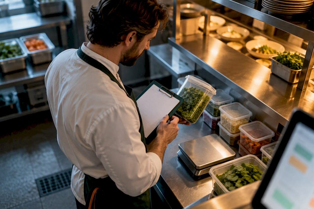
Three metric groups drive every profitable kitchen: production and COGS, KDS performance, and inventory health. If your kitchen dashboard metrics do not track all three weekly, you are managing blind. Review them every week, on a fixed day, and fix what drifts before it compounds. PantryHub captures each group in one screen, which is why weekly review works instead of feeling like extra homework.
TL;DR:
- Tracking variance-to-theory in recipe costs helps identify portioning and waste issues before they impact profit margins.
- Monitoring median bump time and heat maps reveals service slowdowns that may be hidden by averages or weekly reports.
- Using days of stock and inventory turnover enables accurate short-term ordering and long-term category performance analysis.
- Conducting weekly, team-involved reviews on fixed days maintains data trust, highlights operational drifts, and prompts immediate action.
- Ensuring data accuracy through regular stock checks, updated recipe sheets, and integrated POS systems prevents misleading metrics and false confidence.
Table of Contents
- What Kitchen Dashboard Metrics Actually Matter
- Production Metrics: COGS Blind Spots And Invisible Losses
- KDS Metrics: Bump Time, Throughput, And Service Promises
- Inventory Metrics: Days Of Stock, Turnover, And Trust
- Reading A Kitchen Dashboard In Five Seconds
- Setting Up PantryHub To Capture These Numbers
- Making The Weekly Review Actually Change Behavior
- Why Your Numbers Keep Looking Wrong
- Why Consistent Measurement Beats Ad-Hoc Reports
- Start Tracking These Metrics This Week
- Sources
- FAQ
What Kitchen Dashboard Metrics Actually Matter
Not every number deserves screen space. The metrics worth tracking cluster into five groups, and each one answers a different operational question you face daily.
- Production and COGS: is the recipe costing model matching what actually leaves the walk-in?
- KDS and performance: are tickets moving fast enough to hit your service promise?
- Inventory and stock health: will you run out, or are you sitting on cash tied up in unused stock?
- Waste: where is product dying before it reaches a plate?
- Prime cost roll-up: combining food and labor cost percentages into one number that tells you if the whole operation is healthy.
Each group informs a specific decision. Production metrics shape menu pricing. KDS metrics shape staffing during peak windows. Inventory metrics shape ordering timing. As a rough benchmark, food cost percentage typically runs 28 to 35 percent depending on concept, and prime cost above 60 percent usually signals a problem worth investigating immediately, according to SimpleKPI's restaurant KPI framework.
Production Metrics: COGS Blind Spots And Invisible Losses
Theoretical cost of goods sold assumes every recipe is made exactly as written and every portion lands on the gram. Actual COGS reflects what really happened, including over-pouring, double portions, and prep waste. The gap between the two is where margin quietly disappears, and most kitchens never measure it directly.
A dashboard built for this needs a variance-to-theory widget, not just a single cost percentage.
- Recipe variance: theoretical cost versus actual cost per recipe, updated as sales post
- Waste-by-recipe: which dishes generate the most trim, spoilage, or return waste
- Yield adjustment factor: how much usable product a raw ingredient actually produces after prep
- Inter-unit transfers: stock moved between stations or locations, which can hide shrinkage if untracked
Statistic to watch: a variance-to-theory gap wider than 3 to 4 percentage points on a high-volume item is usually a portioning or waste problem, not a pricing problem. Chasing menu price increases without fixing that gap first just masks the leak.
KDS Metrics: Bump Time, Throughput, And Service Promises
Bump time measures how long a ticket sits before the kitchen marks it complete. Use the median, not the average, because one slammed Friday night skews a mean badly enough to hide the pattern you actually need to see, according to Fresh KDS performance reporting from SpotOn.
Three widgets do most of the work here:
- Median bump time trend: a rolling line that shows whether service is getting faster or slower week over week
- Short-window throughput counters: orders cleared in the last 15 or 30 minutes, which flags a bottleneck while you can still fix the shift
- On-time/caution/late breakdown: a status split that separates "fine" from "slipping" from "already late," pulled from Fresh KDS's in-app metrics
Calendar heat maps reveal patterns averages miss entirely. A kitchen that looks fine on paper might experience every Tuesday lunch running substantially slower than the weekly median. Without a heat map, that pattern hides inside a single average number for months.
Inventory Metrics: Days Of Stock, Turnover, And Trust
Days of inventory tells you how many days of stock you are holding at current usage rates. Divide the value of stock on hand by average daily usage. Inventory turnover ratio tells you how many times that stock cycles through in a period, calculated as cost of goods sold divided by average inventory value.
Use days of inventory for short-term ordering decisions and turnover for spotting slow-moving categories over a month or quarter.
- Low-stock alerts by SKU: triggered against supplier lead time, not a flat number, so a slow supplier gets a bigger buffer
- Sell-through rate: percentage of stock that moves before it expires or spoils, a core inventory dashboard metric
- Inventory accuracy rate: how closely your digital counts match physical reality
- Days since full stock check: a trust metric that keeps every other number honest
Pro Tip: If "days since full stock check" climbs above a certain threshold, treat every other inventory number on the dashboard as a guess, not a fact.
Inventory KPIs are not separate from COGS and waste. A stock check that reveals higher-than-expected shrinkage is the same event that should push your recipe variance number up on the production side. If the two dashboards do not move together, one of them has a data problem.
Reading A Kitchen Dashboard In Five Seconds
Managers who check dashboards daily do not read every number. They scan four things:
- Prime cost trend line: is it climbing, flat, or falling versus last week?
- Active low-stock alerts: how many, and how urgent?
- Any bump-time spike: did yesterday's dinner service blow past the median?
- Waste exceptions: any single item logging unusual loss?
A weekly fixed-day review catches drift a monthly report always misses, because by the time a monthly number moves, the decisions that caused it happened weeks earlier, according to NetSuite's restaurant KPI guidance. Run a 15-minute Monday check: pull four-week trends, not just last week versus this week, and set targets before you look at the numbers, not after. Fix on-the-spot issues immediately (a missed portion scale, an obvious spoilage event). Schedule anything needing coaching for the next shift briefing. Monitor slow drifts for a second week before reacting.
Setting Up PantryHub To Capture These Numbers
You do not need a dozen software connections to get useful kitchen dashboard metrics. Four data sources cover almost everything above: your POS, your recipe cost sheets, supplier invoices, and regular stocktakes.
- Low-stock alerts trigger automatically once SKU-level thresholds are set
- Recipe-level usage tracking flags variance between theoretical and actual cost per dish
- A mobile stocktake app lets staff count on the floor instead of transcribing clipboard numbers later
- Multi-location comparison surfaces which site is drifting before it shows up in monthly totals
Pilot one menu section first. Calibrate recipe yields against real prep output, coach portioning where the numbers disagree, then set targets and expand. Details on ingredient-level stock tracking and setting up inventory alerts walk through the setup in more depth.
Making The Weekly Review Actually Change Behavior
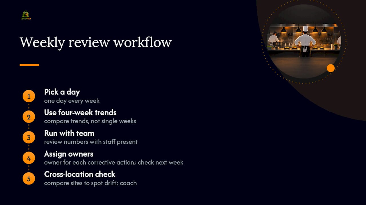
Pick one day, every week, and stick to it. Compare four-week trends rather than a single week's snapshot, because one slow Tuesday tells you nothing on its own. Run the review with your team present, not as a report handed down. Reviewing numbers with staff instead of at them is what builds ownership over the outcome, according to RMIT's research on food-waste review practices.
Assign an owner to every corrective action, and check it the following week. Cross-location comparisons often reveal drift a single-site manager would never spot: if one location's waste-by-recipe number for a signature dish is double another's, that is a coaching conversation, not a pricing problem. A waste callout on a protein item, for example, usually traces back to one shift's portioning habit rather than a supplier issue.
Why Your Numbers Keep Looking Wrong
Bad data is the fastest way to kill trust in a dashboard. Once a manager catches one wrong number, they stop checking any of them, and the whole system quietly reverts to gut instinct.
Most inaccuracies trace back to three causes. First, stale stocktakes: if nobody has done a full physical count in three weeks, every inventory KPI downstream is built on a guess. Track "days since full stock check" as a standing metric precisely because it flags this before it becomes invisible, a practice Geckoboard's inventory dashboard framework recommends specifically to protect data trust.
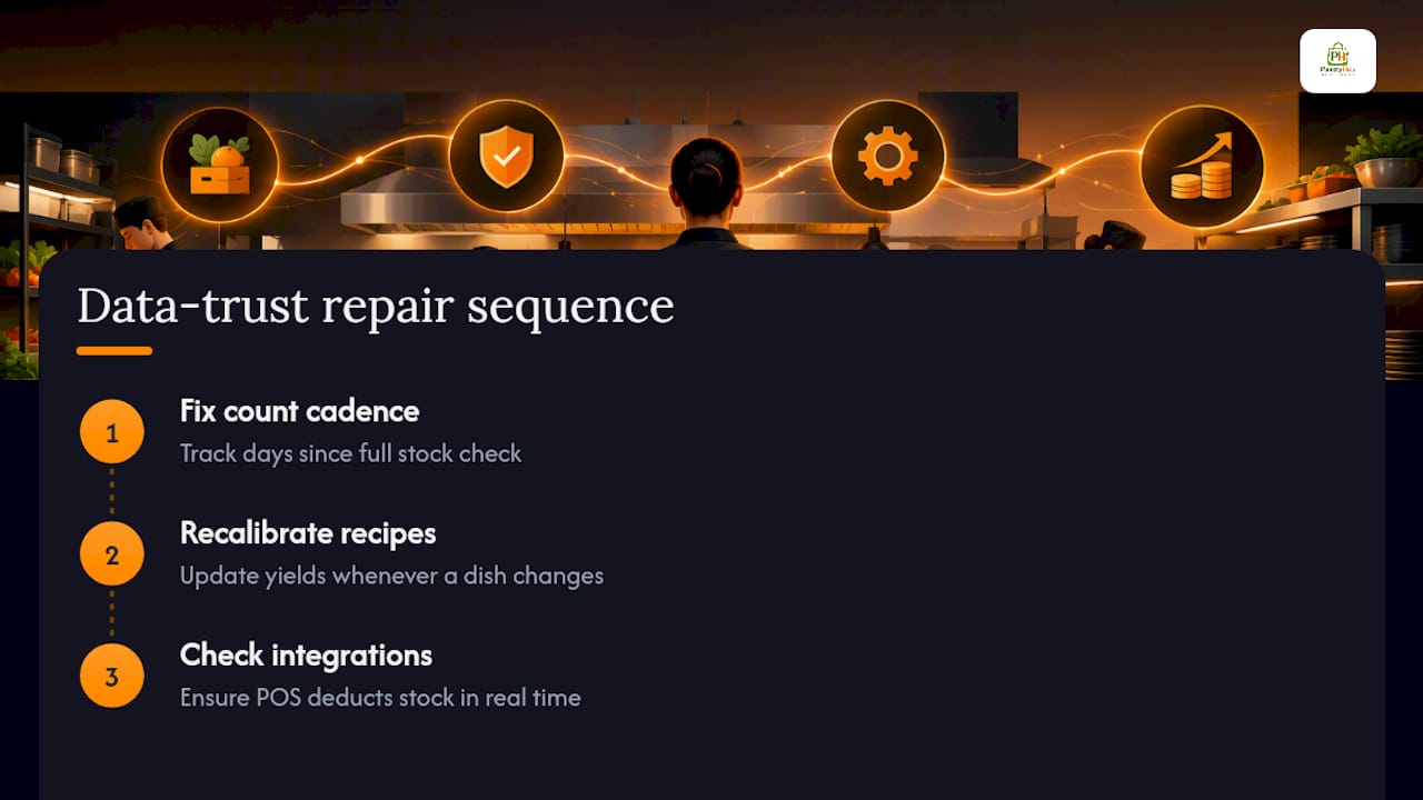
Second, recipe sheets that do not match what actually happens on the line. If a chef adjusts a recipe on the fly but nobody updates the cost sheet, every variance calculation from that point forward is comparing reality against a fiction. Recalibrate recipe yields any time a dish changes, not just once a year.
Third, integration gaps between POS and inventory systems. A sale that posts in the POS but never deducts from stock creates a slow, silent drift that looks fine for weeks and then produces a shocking stocktake. Check that every sales channel, including delivery apps, actually depletes inventory in real time; order-type differences between online and dine-in affect kitchen load in ways that also affect how cleanly your data reconciles.
Fix the count cadence first, then the recipe sheets, then the integration gaps. Chasing accuracy in the wrong order wastes a lot of a manager's Monday morning.
Why Consistent Measurement Beats Ad-Hoc Reports
Kitchens that review the same metrics on the same day, every week, build predictable margins over time. Ad-hoc reporting catches problems only after they have already cost money for a month. The habit matters more than the software, though the right dashboard makes the habit far easier to keep.
— Admin
Start Tracking These Metrics This Week
PantryHub is built specifically for hospitality operators who need these numbers without hiring a data analyst. It brings production, KDS, and inventory metrics into one mobile-first view, with AUD pricing and local support built for the way Australian kitchens actually operate.
Low-stock alerts, recipe-level usage tracking, and a mobile stocktake app mean your team captures the data on the floor, not after the shift ends in a spreadsheet. If you are still reconciling supplier invoices by hand, the signs your kitchen needs inventory software are worth a quick read first.
Start a free trial and run a two-week pilot on one menu section: calibrate your recipe yields, set your low-stock thresholds, and see your first variance report before committing. Plans start at $39 per month for Starter, with Regular at $69 and Pro at $99, depending on how many locations and features you need.
Sources
FAQ
What KPIs Should My Dashboard Track?
Prioritize prime cost percentage, food cost percentage, labor cost percentage, inventory turnover, and waste by recipe, since these five cover pricing, staffing, and ordering decisions. PantryHub tracks all five automatically from POS and recipe data, alongside common restaurant KPI benchmarks like table turnover and average customer spend.
What Is The 5 Second Rule For Dashboards?
Managers who check dashboards daily do not read every number. They scan key metrics in seconds to see if the kitchen is on track. That means checking prime cost trend, active low-stock alerts, any bump-time spike, and waste exceptions in a single scan.
What Are Metrics On A Dashboard?
Metrics on a kitchen dashboard are the individual data points, like median bump time, days of inventory, or food cost percentage, that get grouped into KPIs to measure a specific operational outcome. A single metric tells you what happened; grouping several into a KPI tells you whether that outcome is good or bad against a target.
What Is A KPI In A Dashboard?
A KPI, or key performance indicator, is a metric tied directly to a business goal, like keeping prime cost under 60 percent or inventory turnover above a set threshold. Not every number on a dashboard is a KPI; some are supporting data, like days since full stock check, that exist to keep the KPIs trustworthy.